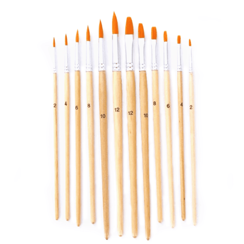
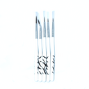
12pcs Variety Brush Set
Free Shipping over $100 AUD
Enough paint guaranteed

Description
Big variety- comes in 12 different shapes and sizes for every situation
Great quality - The nylon hair is soft but still holds its shape. The wooden handle is comfortable but still sturdy.
Easy to clean- Holds its shape without shedding.
The Variety set comes with 6 round paint brushes and 6 flat paint brushes in varied sizes.
The hair on these paint brushes is easy to clean without shedding. It's flexible and soft but still have a good bounce back and holds the shape.
How To
How it works
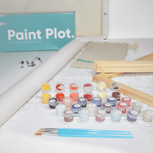
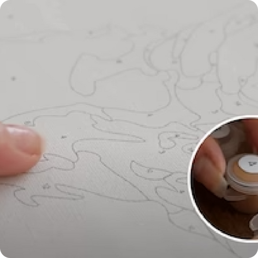
The container and canvas are marked with corresponding numbers.

Paint the container number (14) to the corresponding number (14) on the canvas.

Apply all the paint with the corresponding numbers on the canvas until complete

Once all the paint is applied, your painting will be complete.

Setting Up
- Choose a comfortable chair and surroundings, with plenty of space and light.
- A small container of water and a cloth is required to wash and dry paints between colours.
- Make sure your paintbrush is dry before dipping it into the paint pots.
Helpful Tips
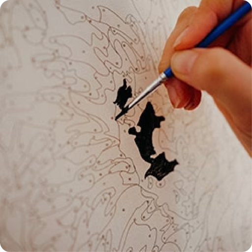
- Start with the smallest areas, then work your way up to medium then large.
- Paint the whole of one colour first, don’t stop and start.
- Be sure to let the paint dry between colours to avoid any smudging
- There should be no gaps between colours.
- Take a picture of your blank canvas, it helps with small areas that can be painted over by mistake.
Specs
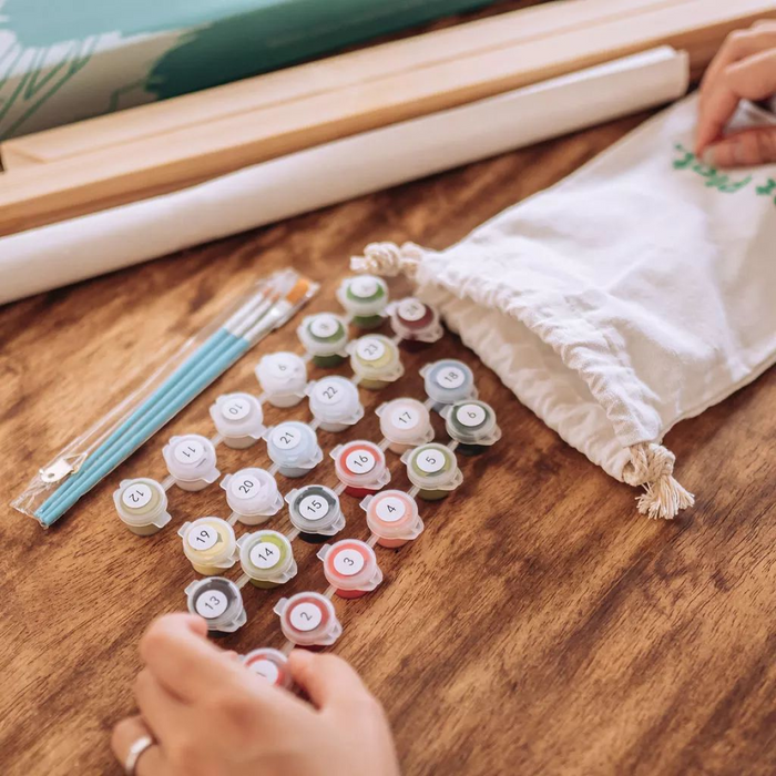
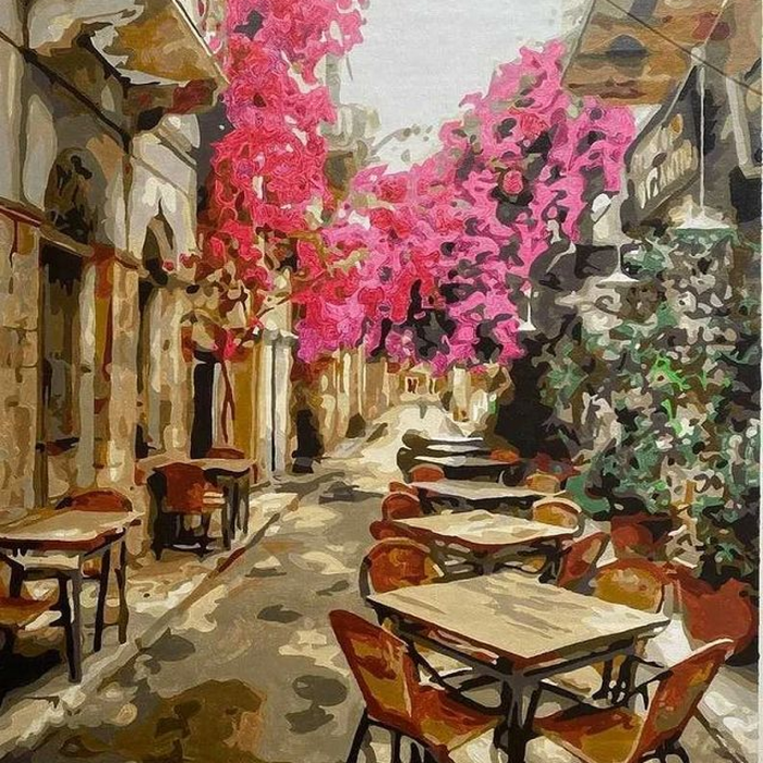
Paint Plot Paint By Numbers kit
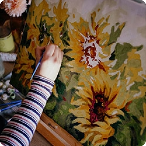
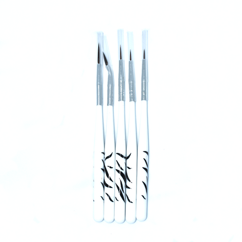
In addition to your canvas, you will also receive a full set of acrylic paint and paint brushes. You can also purchase a framing kit for an additional cost.
A complete acrylic based paint-set, with all the colors you need
3 different paint brushes for wide and narrow areas
*Optional Frame - Add an optional frame to your Canvas.
Specifications
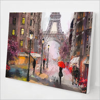
Canvas Size: 16" x 20" / 40 x 50cm
Canvas Material: Linen Canvas
Paint Type: Acrylic
Frame Material: Timber
Shipping
||shipping_location||
Free Shipping: Free domestic shipping on orders over ||free_shipping_amount||!
Processing Time: All orders leave our warehouse within 48 hours on business days.
Shipping Time Estimates:
||shipping_times_table||
Please keep in mind delivery times listed above are our best estimate.
Tracking: You will receive a shipping confirmation with a tracking number as soon as your order has been sent out.
Returns: Simple Returns up to 30 days from when you received your item.
Money Back Guarantee: We offer an easy, hassle-free 30-day money back return policy.
For complete details, read our Returns policy.
Please contact us at support@paintplot.com.au with any questions.